Kepler Agency Docs
Kepler Agency brand system and style guide.
Built from the same typography and spatial discipline as Kepler Dealer, but translated into the Agency green brand family, naming, and component language.
Core Brand
Agency inherits the system, not the purple.

Font
Inter Variable
Accent family
Agency Green
Structure
Dealer-grade spacing
Tone
Premium and direct
Typography
One family, two voices, clear hierarchy.
Kepler Agency uses the exact same Inter-based structure as Dealer, but the semantic type system now lives natively in this project through shared `type-*` utilities.
System
Font Foundation
The entire brand stays on one family: Inter variable, loaded locally in `src/app/layout.tsx`. Contrast comes from weight, scale, and space instead of mixing typefaces.
400
Body copy
500
Quiet emphasis and pills
600
Headings, buttons, eyebrows
700
Rare, surgical emphasis only
type-h1
Hero only
Tint-shop growth, sharpened.
type-h2
Section heading
Agency systems built with discipline.
type-h3
Subsection
Campaign structure with clear intent.
type-h4
Card title
Performance dashboards
type-body-lg
Lead copy
Agency body copy stays calm, spacious, and readable even when the idea is dense.
type-body
Default paragraph
This is the default paragraph voice for explanatory sections, feature blurbs, and most page copy.
type-body-sm
Meta and support
Supporting notes, labels, disclaimers, and quiet UI metadata live here.
Color
Agency green supports the story instead of overwhelming it.
The palette mirrors Dealer’s structural approach: black and white carry most surfaces, while green is concentrated into CTAs, highlights, gradients, and a few energetic moments.
Primary
#ABDF3B
Main energy and signal
--brand-primary
Secondary
#88C345
Primary CTA and active accents
--brand-secondary
Dark
#23370C
Deep green grounding tone
--brand-dark
Mid
#5D8E28
Support accent and gradients
--brand-mid
Bright
#C4EE56
Spark moments and highlights
--brand-bright
Light
#E8F6BF
Soft tint for glow and text gradients
--brand-light
Neutral
#646464
Quiet supporting copy
--brand-neutral
Surface
#F9F9FA
Light panels and shells
--brand-surface
Usage
Primary and secondary greens lead action.
Use the secondary green most often for CTA fills and active emphasis. The primary and bright tones are best for gradients, glow, and directional accents.
Balance
White and black still own the layout.
Most backgrounds should stay black, white, or very soft neutral surfaces. That keeps the site premium and lets green feel intentional.
Guardrail
Avoid generic SaaS green.
Do not drift toward unrelated lime or emerald palettes. The Agency system should stay tied to the exact palette in `AGENCY_BRAND_REFERENCE.md`.
Rhythm
Spacing, radius, and containers do the quiet brand work.
The site should feel composed before it feels decorated. These layout tokens keep Agency pages aligned with Dealer’s pace while preserving the Agency look.
Spacing
Core Layout Tokens
These are the defaults. Reach for them before inventing one-off spacing.
page-section-hero
pt-22 pb-12 on mobile, pt-40 pb-28 on desktop
page-section
py-14 on mobile, py-28 on desktop
page-section-compact
py-12 on mobile, py-24 on desktop
page-stack
space-y-10 on mobile, space-y-14 on desktop
Radius Scale
Pill
rounded-full
Tile
rounded-[1.35rem] sm:rounded-[2rem]
Surface
rounded-[1.5rem] sm:rounded-[1.75rem]
Hero image
rounded-[2rem] sm:rounded-[2.4rem]
Component DNA
Buttons, surfaces, and imagery should feel calm but expensive.
These are the core primitives that carry the Agency personality across marketing pages, docs, and future rebuilds.
Buttons
Rounded, weighty, and direct.
Use fully rounded buttons, semibold type, and restrained motion. Primary buttons carry green. Outline buttons stay quieter.
Surfaces
Glass where needed, white cards where clarity matters.
Dark sections can use glass or translucent panels. Light sections should lean on crisp white cards with gentle shadows.
brand-glass
brand-surface-card language
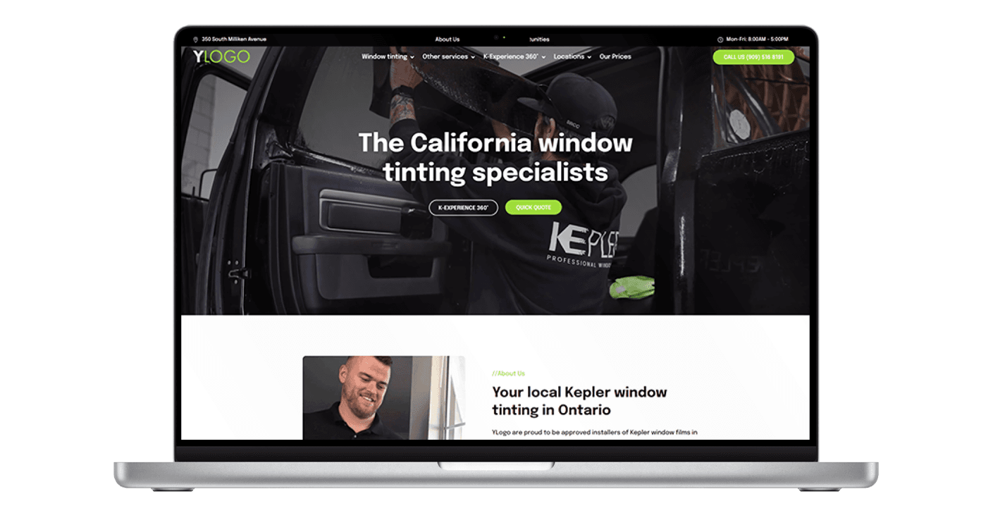
Imagery
Photography over icon grids.
Use real product, dashboard, or business imagery. Keep crops intentional, corners rounded, and hover movement subtle.
Rules
Simple constraints keep the brand sharp.
These are the defaults to keep future Agency work aligned when pages expand or new contributors touch the system.
Guardrail
Use Inter everywhere. Weight, not a second typeface, creates contrast.
Guardrail
Black and white do most of the visual work. Green guides attention.
Guardrail
Headings use semantic `type-*` utilities or native heading tags.
Guardrail
Buttons and pills stay fully rounded. Photos never ship square-cornered.
Guardrail
Spacing should feel generous before it feels dense.
Guardrail
Shared primitives should prefer `brand-*` naming over `dealer-*` when updated.